Leading data strategy and design for Amex's central risk data platform.
American Express, Central Risk Data Platform — 2025 to Present
My Role
Product Manager
Focus
Data strategy, governance and design
Timeline & Status
2025 – Present Ongoing
Overview
Between the people who own the data and the people who depend on it
At American Express, I lead data strategy and design for the central risk data platform: the system that sources and provisions data across the enterprise so teams can manage risk, report on it, and stay compliant. My work sits between the people who own the data and the people who depend on it. I shape how data is governed and delivered, and I design the experience risk professionals use to find it and trust it.
Details
The rest is under NDA
This work is under NDA, so I can't share details here. I'm happy to walk through it in conversation.
Writing a resume that stands out is mostly guesswork. Students get plenty of advice and templates, but almost no proof of what actually gets past a recruiter’s screen.
So I teamed up with five software engineer friends to build Resumes.fyi: a library of crowdsourced resumes that passed the screening process at more than 140 tech companies. As co-founder and chief product officer I owned product strategy, and as the only designer I owned everything from branding and identity to interaction design and usability testing.
A crowdsourced library has a built-in catch: nobody browses an empty shelf, and nobody shares to a shelf no one visits. Every design decision that follows comes back to that loop: bring people in, make it easy to give back, and make what they find worth returning for.
10Kusers registered at launch
3,000+resumes submitted during beta
52%more submissions after the upload redesign
140+tech companies represented
Research
Understanding the problem space
Before designing anything, I wanted to confirm this was a real problem. We surveyed 584 people about job applications and resume prep, then ran 25 in-depth interviews with university students, recent graduates, and experienced professionals, over Microsoft Teams and in person.
584people surveyed
25in-depth interviews
The answer kept coming back the same way: people didn’t want more advice. They wanted real examples, from people like them, at the companies they were aiming for. We turned that into three personas, and each one shaped a part of the product.
Persona 1Sarah, the first-time job seekerNeeds to see what a passing resume looks like at her level.
Persona 2Claudia, the career switcherNeeds examples from the role she’s moving into.
Persona 3Tommy, the recent gradNeeds to know what specific companies look for.
Finding the gap
Platforms like Cofolios and Levels.fyi share a similar spirit, sharing real portfolios and real salaries. None of them focused on the resume screen itself. That was our opening.
Identity
First, bring people in
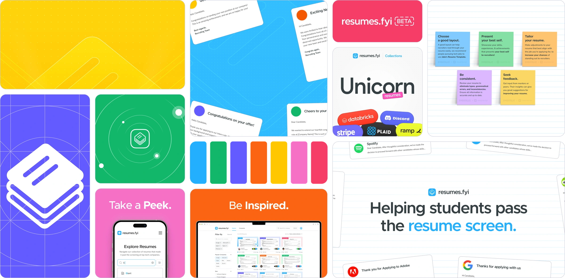
We marketed to people looking for a job, mostly university students. Studying other people’s resumes to figure out what’s wrong with your own can feel tedious, even a little discouraging, and I didn’t want Resumes.fyi to feel that way. So I gave it color: the language of studying, with sticky notes, paper textures, pins, grids and stickers, set in a palette of seven bright colors that keeps the experience light and a little playful.
3.1The brand system: palette, app icon, campaign lines like Take a Peek and Be Inspired, and the study-desk motifs.Image
The identity helped us land 1,000 registrations during the waitlist period before beta.
Upload Flow
Then, make it easy to give back
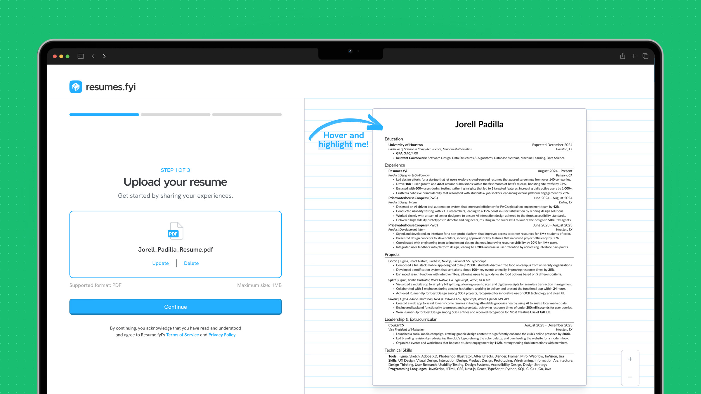
Every new visitor was a potential contributor, so the upload flow had to feel effortless. Early internal feedback said the first version was too long: it felt like filling out a job application. People also worried about legibility, since there was no way to zoom in on a resume.
I cut the flow down to three steps, made anything non-essential skippable, and added a live, zoomable preview so people could see exactly what they were sharing as they went.
4.1Before: a long, form-heavy upload that felt like a job application.After: three short steps, skippable inputs and a live, zoomable preview.Video loop
After we shipped the revised flow, resume submissions rose 52%.
Explore
Make the library worth coming back to
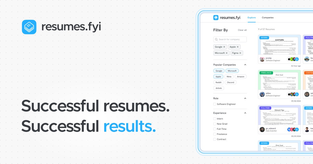
More resumes only matter if people can find the right ones. The explore page, where every uploaded resume lives, had to show what matters without opening a single file: experience level, role, and the companies where the resume passed the screen.
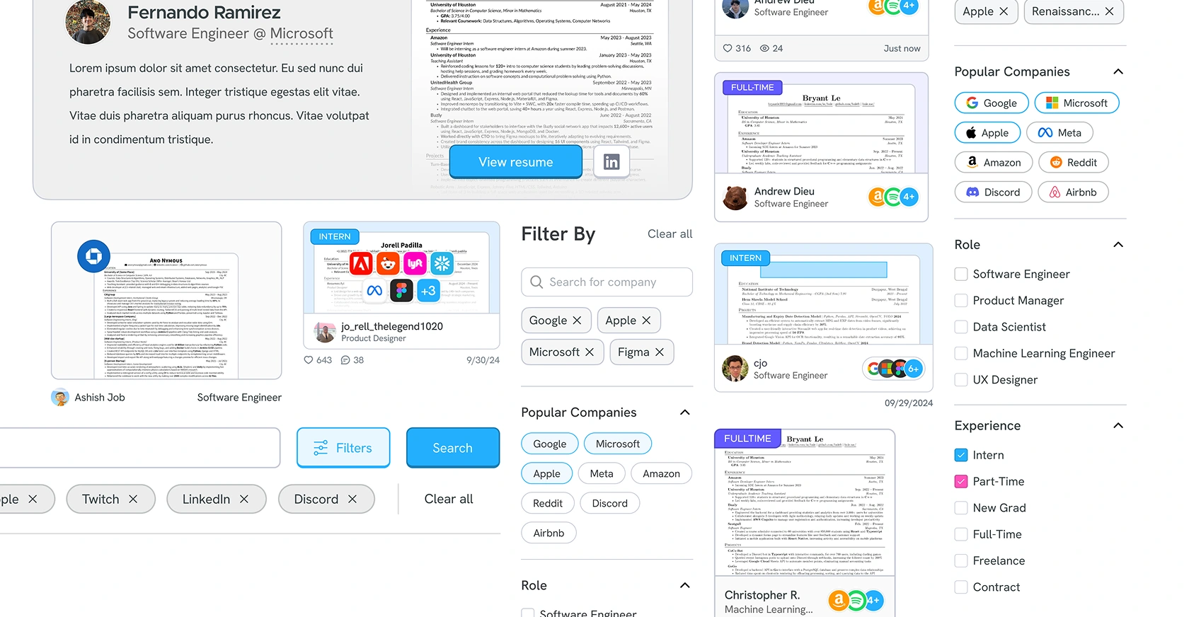
I rebuilt the page from its parts, starting with the pieces people touch most.
5.1The building blocks of the new explore page, refined after the move to Aced.Image
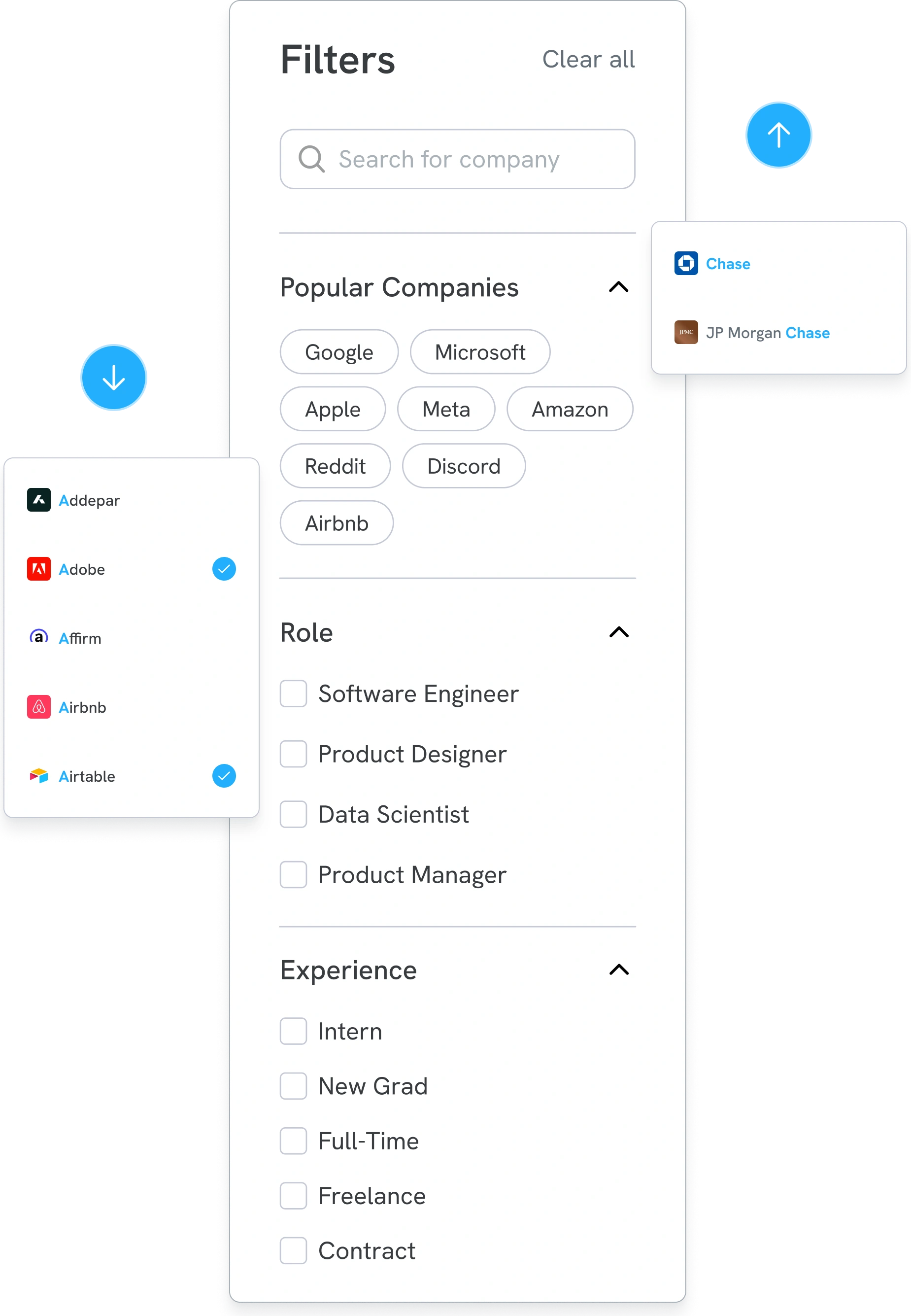
5.2The filter sidebar, with company typeahead.Image
A filter sidebar that stays put
Always in viewFilters live beside the results instead of behind a modal, so people refine without losing their place.
Search 140+ companiesA typeahead with multi-select narrows a long list to the companies someone actually cares about.
One-tap shortcutsPopular companies sit up top as chips for the most common searches.
Easy to scanRole and Experience collapse into short groups, and Clear all resets everything at once.
5.3Turning a dead end into a request.Image
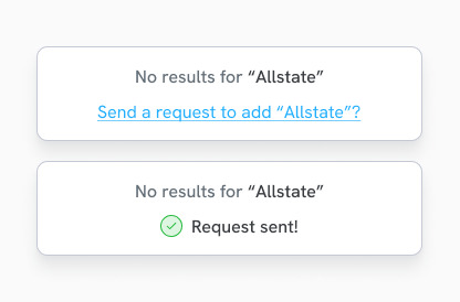
When a company is missing
No dead endsSearching for a company we don’t have yet offers a one-click request to add it, instead of an empty state.
Demand we could seeEvery request showed which companies people wanted next, which told us where to look for new resumes.
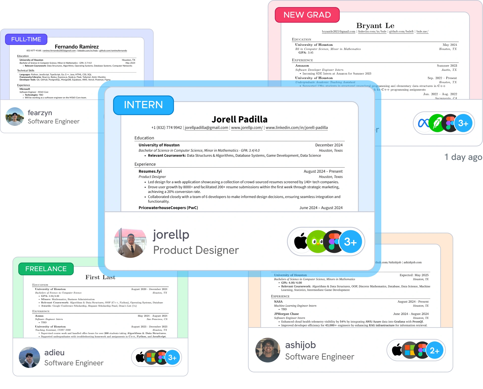
5.4Color-coded resume cards.Image
Resume cards you can read before you open them
Color means experienceIntern, Full-time, New grad and Freelance each get their own color, so a page of results sorts itself visually.
Proof up frontA stack of company logos shows where the resume passed the screen, with a count for the rest.
A real person behind itEach card carries a profile, a role and a date, which builds trust in what you’re reading.
Skim, then commitThe resume preview is large enough to judge at a glance, so people only open the ones that fit.
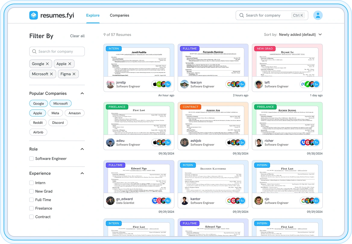
Putting the pieces together
Here’s where those pieces come together. The sidebar anchors the left, a result count and sorting sit up top, and the cards fill a grid you can scan in seconds. We A/B tested this layout against the original page with 40 participants, and 82% preferred it.
5.5The new explore page, and the winner of our A/B test.ImageBeyond the Library
From examples to answers
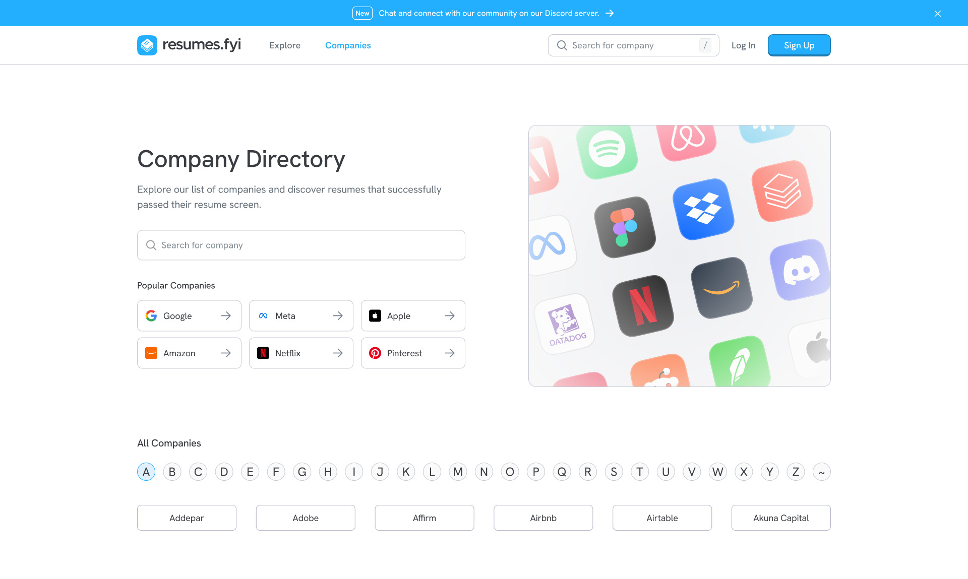
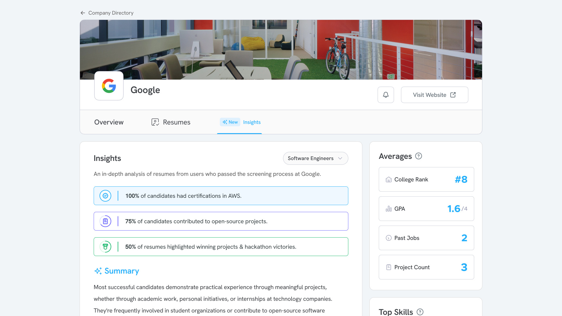
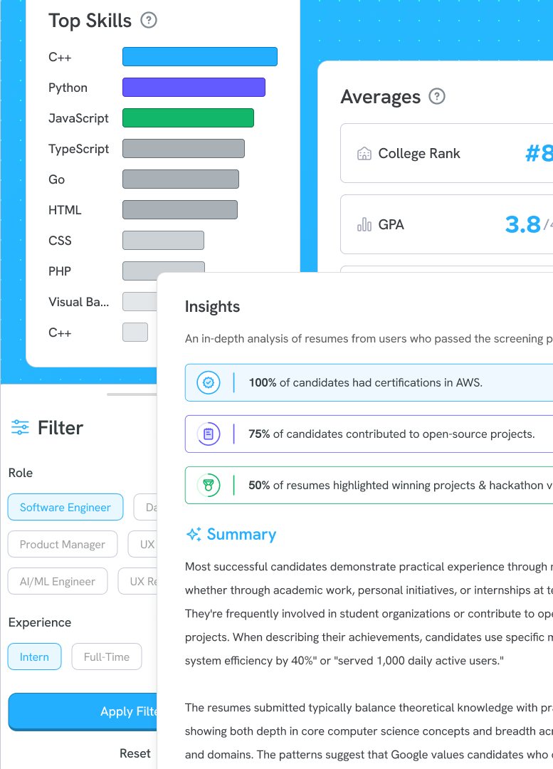
Once people could find resumes, the next question was obvious: what does a given company actually look for? Company pages answer that directly. A directory lists every company in the library, and each company page summarizes the resumes that passed its screen, from common certifications and open-source work to average GPA, past jobs and project count.
As the library grew, Resumes.fyi became an AI recruiting platform. I designed insight dashboards that synthesized more than 600 user interviews into role and candidate fit benchmarks, and developed the ranking logic behind AI resume-to-role matching.
6.1The company directory.Image
6.2A company page, with insights drawn from resumes that passed the screen.Image
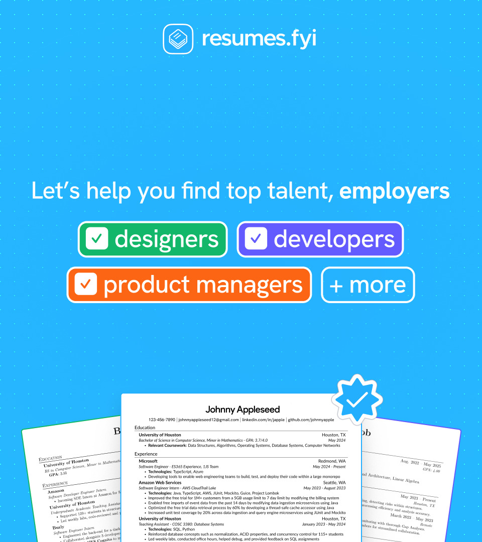
6.3Marketing to employers.Image
The other side of the screen
Same library, new audienceA collection of resumes that passed real screens is also a pool of proven talent.
Reaching employersWe marketed to teams hiring designers, developers and product managers, and recruiters at companies like Vercel and Pinterest used the platform.
Outcome
Acquired by Aced
In December 2025, Resumes.fyi was acquired by Aced. My designs carried over into Aced’s product, putting Resumes.fyi in front of Aced’s full user base: more than 100,000 users, including recruiters at Vercel and Pinterest.
What I learned
01
Solve the supply side first
A library is only as good as what people share. Shortening the upload flow lifted submissions 52%, and everything else depended on that.
02
Let evidence settle it
An A/B test, not opinions, decided the explore page.
What I’d do differently
I’d put real students in front of the upload flow before launch, not after. Internal feedback caught the friction, but testing earlier would have saved us a full redesign.
Showcase
More from the product
8.1Upload with a live, zoomable preview.Image
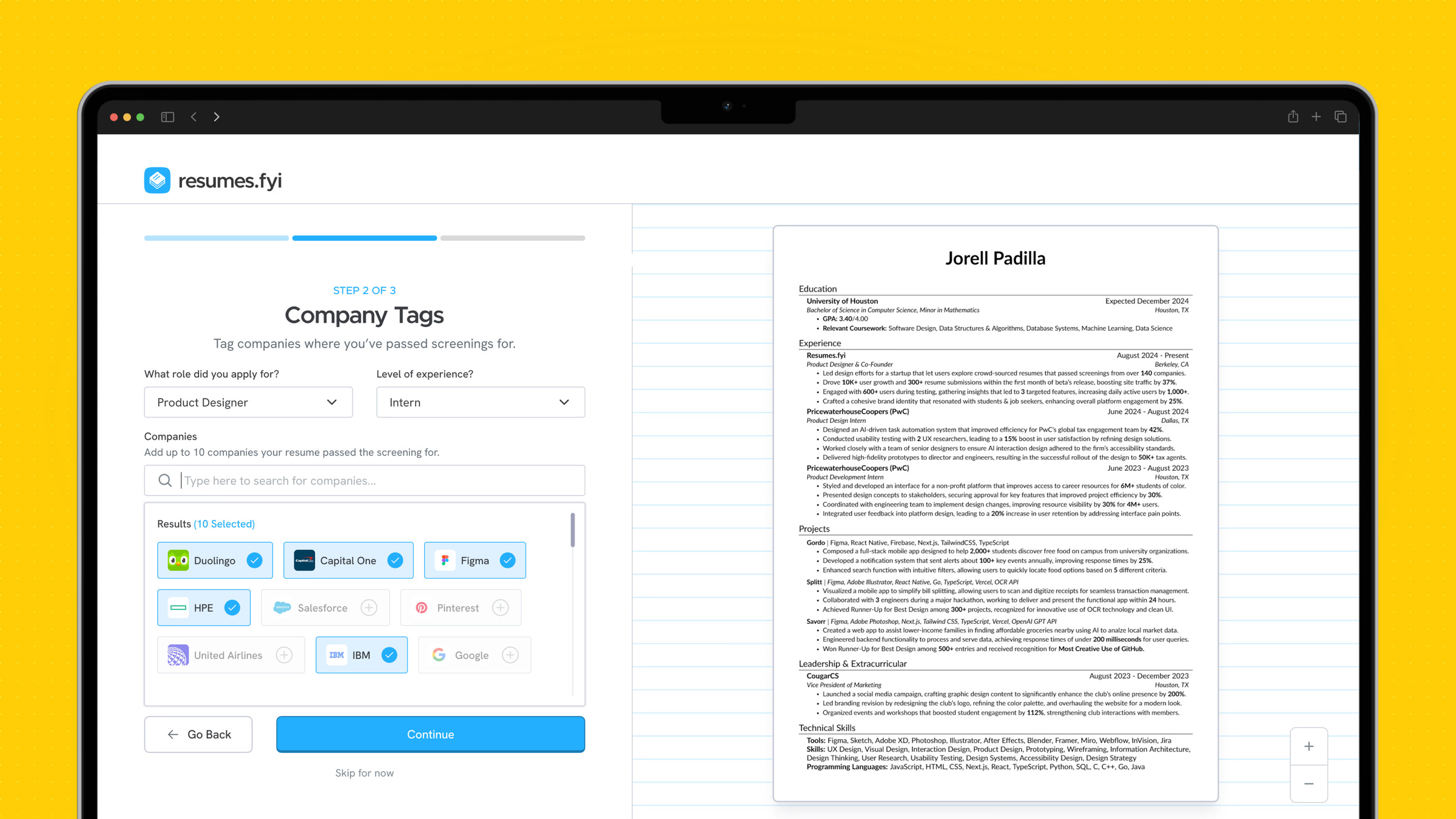
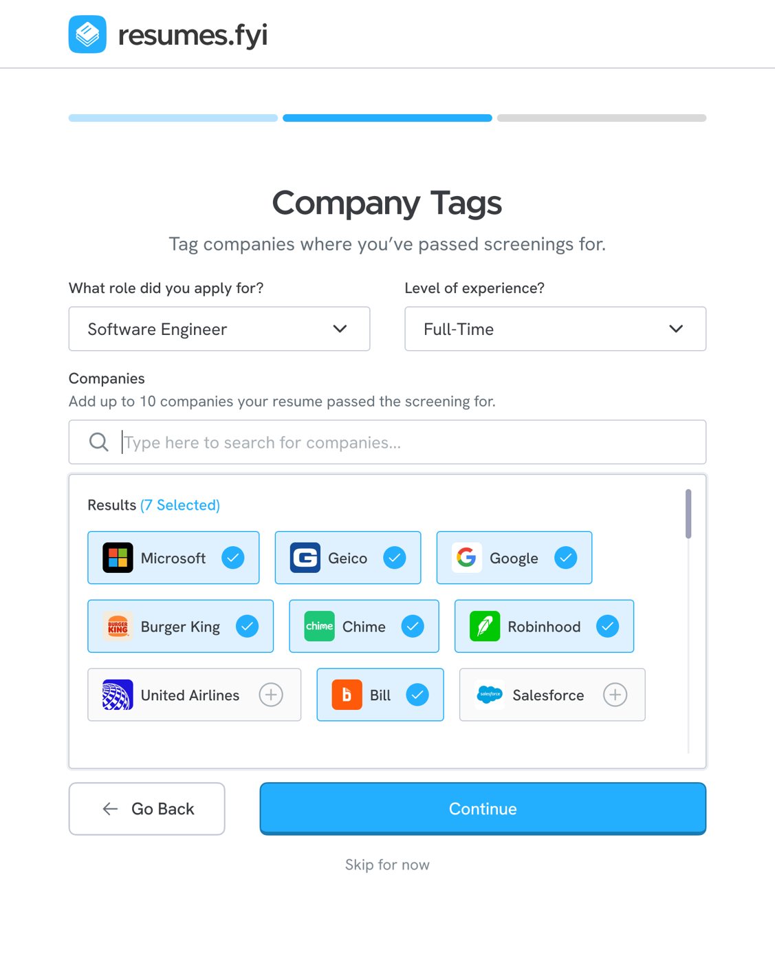
8.2Tagging the companies where you passed the screen.Image
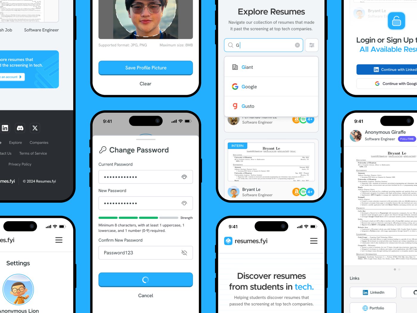
8.3Bringing it to mobile: search, resume viewer, settings and sign up.Image
Giving 50,000 tax analysts back the time they spent fighting their task tool.
PwC, Smart Tasks — Summer 2024
My Role
Product Design Intern
Users
50,000+ tax analysts
Tools
Figma, FigJam
Timeline & Status
Jun – Aug 2024 Internship
Overview
Tax work is complex. The tools shouldn't be.
PwC engagement teams juggle a huge volume of tasks across many clients at once. Early in my internship it was clear the existing task system was adding friction: analysts spent more time navigating the tool than doing the work.
Smart Tasks was my answer. It's an AI layer that learns from how people use the tool, surfaces the tasks that matter now, and handles status updates automatically, so analysts can focus on the calls that need a human.
50K+tax analysts in scope for the redesigned workflow
2 wksshadowing analysts and standups before opening Figma
Autostatus updates, so analysts stop reporting on work and just do it
Research
Feel the friction first
I spent my first two weeks shadowing tax analysts and sitting in on engagement team standups. The goal wasn't only to observe, but to feel where the tool got in the way. By the end I had a clear map of where smart automation could take real load off people.
Design
Design with the constraints, not against them
I worked closely with engineering to pin down which signals the AI could realistically act on in the near term, then designed around those. The result feels intelligent without asking anyone to change how they already work.
The best tools feel like they're already thinking one step ahead of you.
Feedback
What my team said
Jorell quickly adapted to the demands of our project, consistently meeting tight deadlines with grace and professionalism. His ability to deliver above expectations was truly impressive.
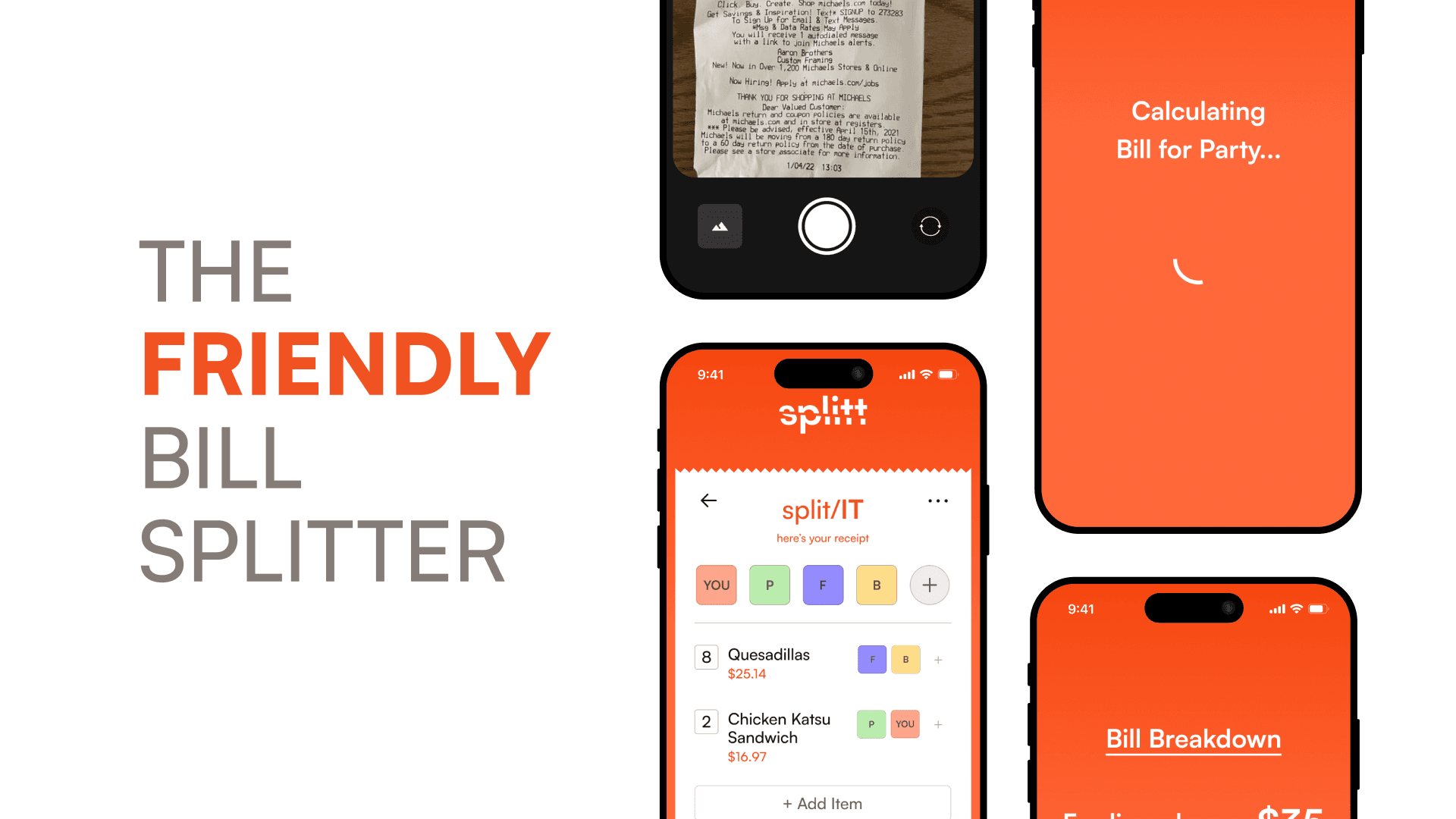
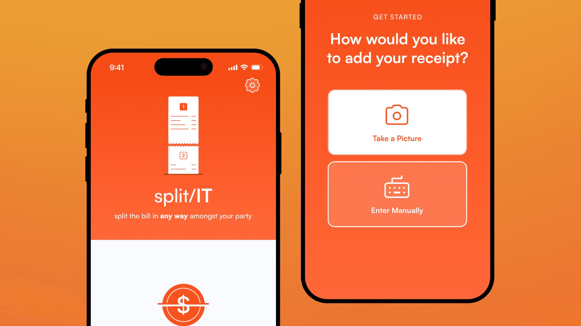
Splitt is a mobile app that makes splitting a bill with friends painless. It scans receipts, itemizes every expense automatically, and lets a group split any way they want, from an even split to tracking exactly who ordered what.
24 hrsfrom blank canvas to working app
200+projects competing at TAMUhack X
2ndplace for Best Design
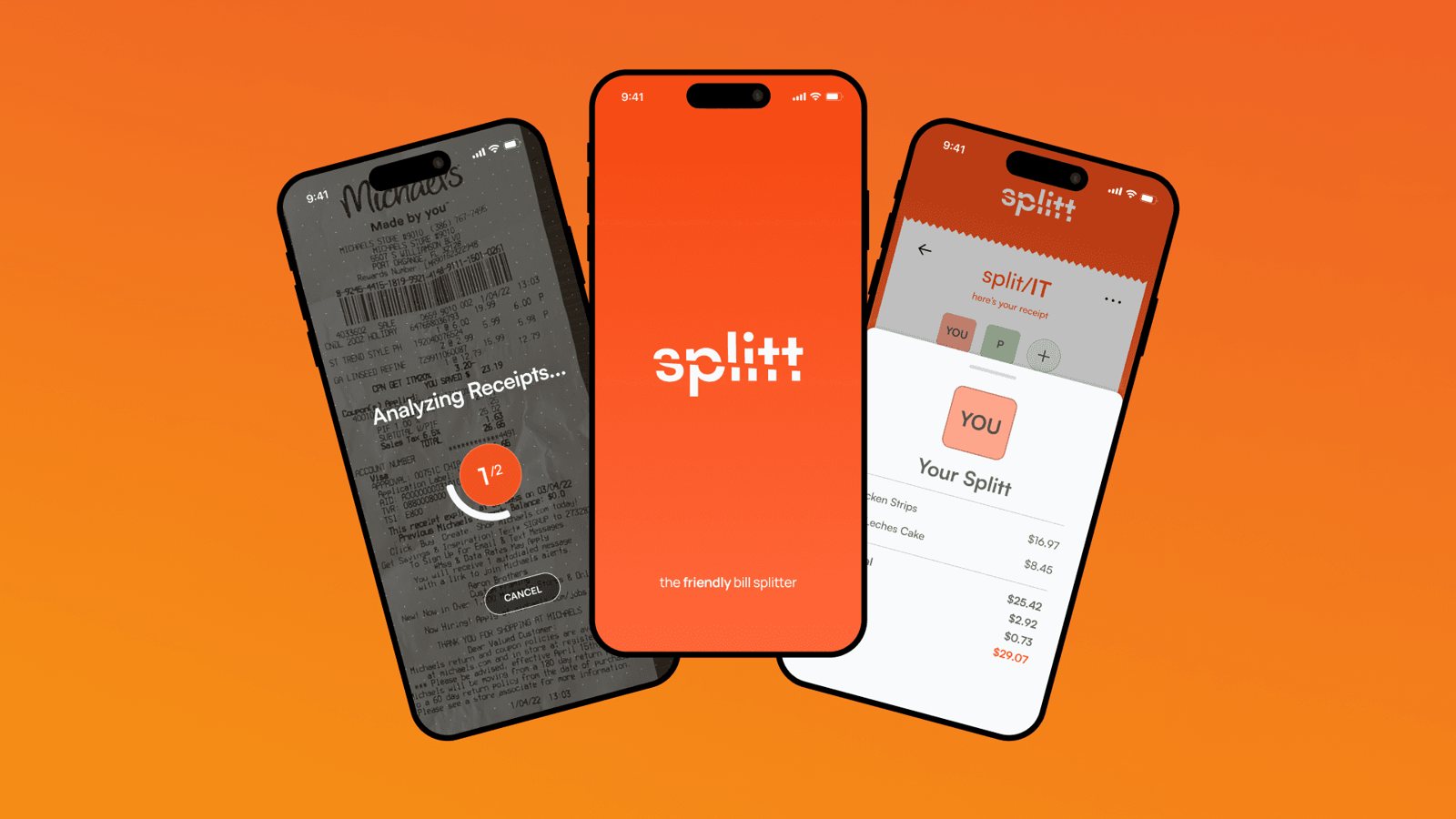
1.1Promotional material: brand and identity.ImageDesign Process
Fast, focused, and built to ship
Mobile design was new territory for our team, so I focused on rapid iteration: getting visuals to the engineers as fast as possible and refining details in parallel.
2.1Home screen design.ImageKey Interactions
Scanning and splitting, without the math
The core challenge was making receipt scanning and item assignment feel effortless, even across several receipts at once.
3.1Multiple receipts: splitting a bill across more than one receipt.Video loopOutcome
24 hours. One real product.
We took an everyday frustration and built a polished, usable solution in a day. Being named runner-up for Best Design out of 200+ projects confirmed that speed and craft can coexist.
4.1The split/IT flow: the main bill-splitting experience from start to finish.Video loop
01
Get visuals to engineers early
In a 24-hour build, an imperfect screen today beats a perfect one tomorrow.
02
Refine in parallel
Polishing details while engineering built kept both moving.
03
Speed and craft can coexist
A day was enough to ship something people found delightful.
Closing the gap between 6 million students and the mentors who could change their careers.
PwC, Career Resources Platform — Summer 2023
My Role
Product Development Intern
Users
6M+ students
Tools
Figma, Python
Timeline & Status
Jun – Aug 2023 Internship
Overview
Access to opportunity shouldn't depend on who you know
In my first PwC internship I worked on a platform for a non-profit that connects underserved students with career mentors and resources. The platform existed, but it wasn't working. Students weren't finding mentors, mentors weren't replying, and engagement showed it.
30%lift in mentor response rate after the redesign
27%more student engagement with career resources
2core flows redesigned from the ground up
Research
Data first, then design
Before opening Figma, I used Python to analyze engagement data: drop-off rates, session lengths, and click paths. It pointed to two problems. Students struggled to find relevant mentors, and mentors had a hard time managing incoming requests.
Design
Search the way students think
I rebuilt mentor discovery around filters that match how students actually search: by industry, career stage, and company, instead of abstract categories. For mentors, I simplified the dashboard so the most actionable requests come first.
Good design for equity is about removing every unnecessary barrier between a student and an opportunity.
Takeaways
What I took away
01
Let the data point the way
Engagement data showed exactly where students and mentors were getting stuck.
02
Match how people already think
Filters built on real search habits beat abstract categories.
03
Design for both sides
Helping mentors respond was as important as helping students ask.
A loose collection of things I've designed over the years: logos, side projects, club graphics and a few experiments.
Cerena app icon in the dockBranding
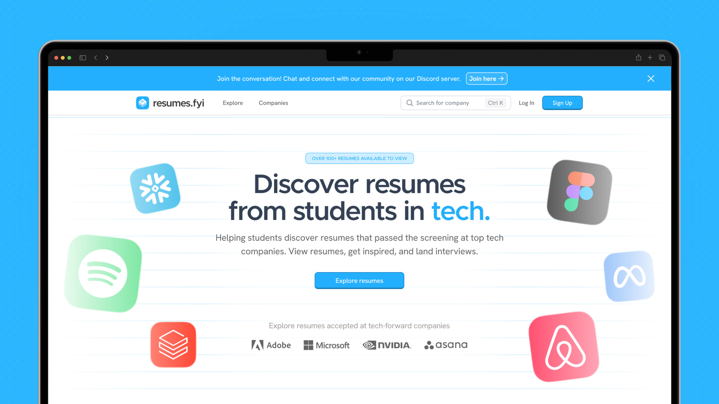
resumes.fyi home pageProduct
Resumes.fyi company tagsProduct
Splitt app screensProduct
Resumes.fyi notifications panelProduct
resumes.fyi brand systemBranding
Resumes.fyi request a companyProduct
Splitt brand panelBranding
Okimori wordmarkBranding
resumes.fyi explore pageProduct
Resumes.fyi app screensProduct
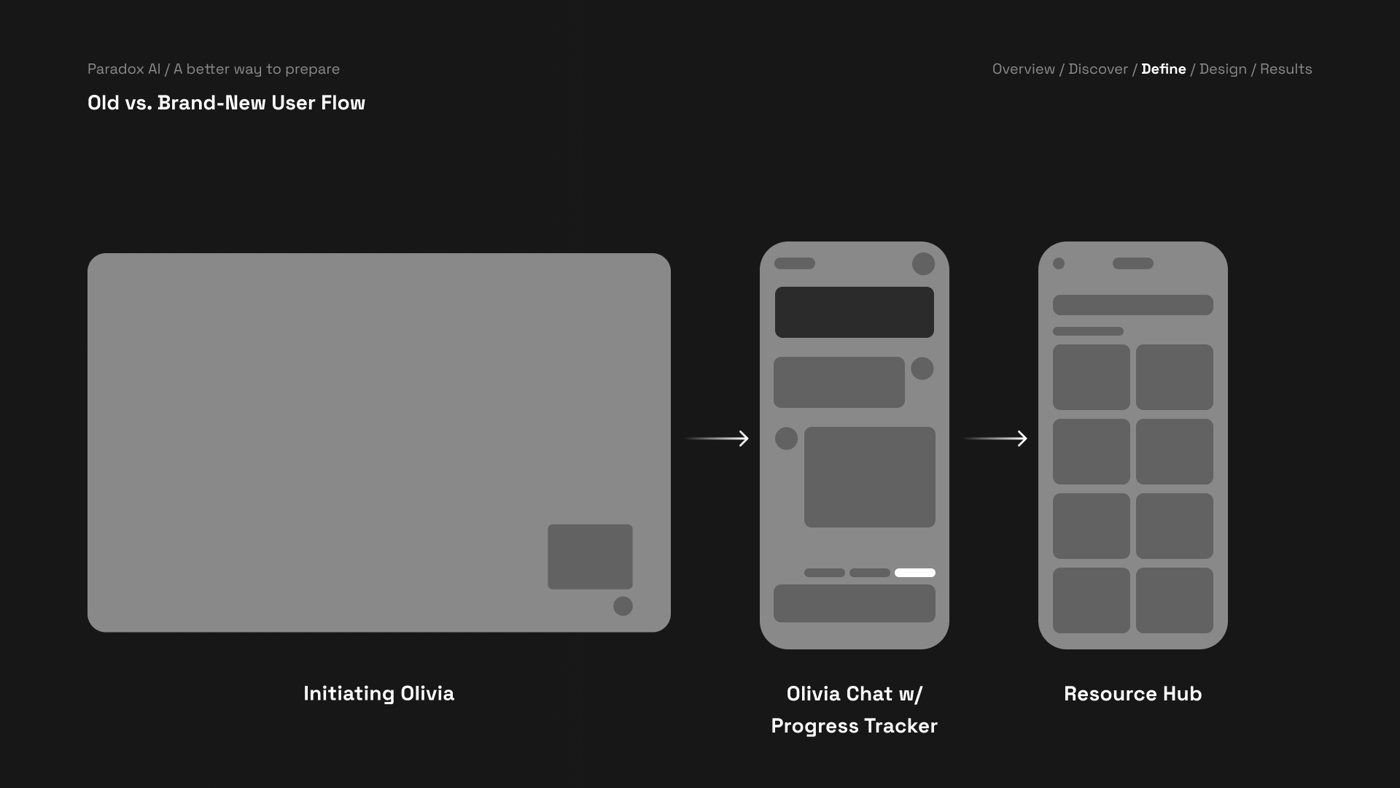
Paradox Olivia user flowProduct
resumes.fyi explore componentsProduct
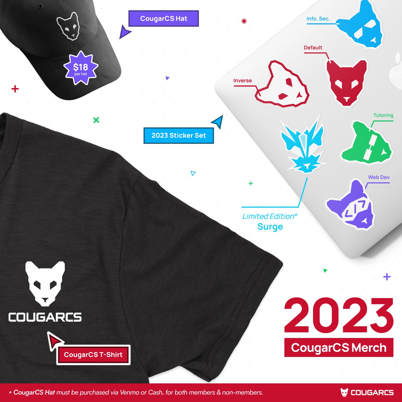
CougarCS 2023 merchBranding
Splitt home screenProduct
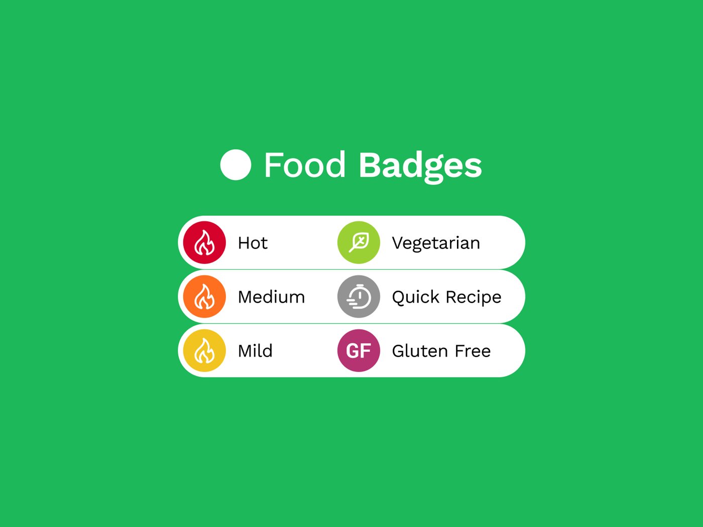
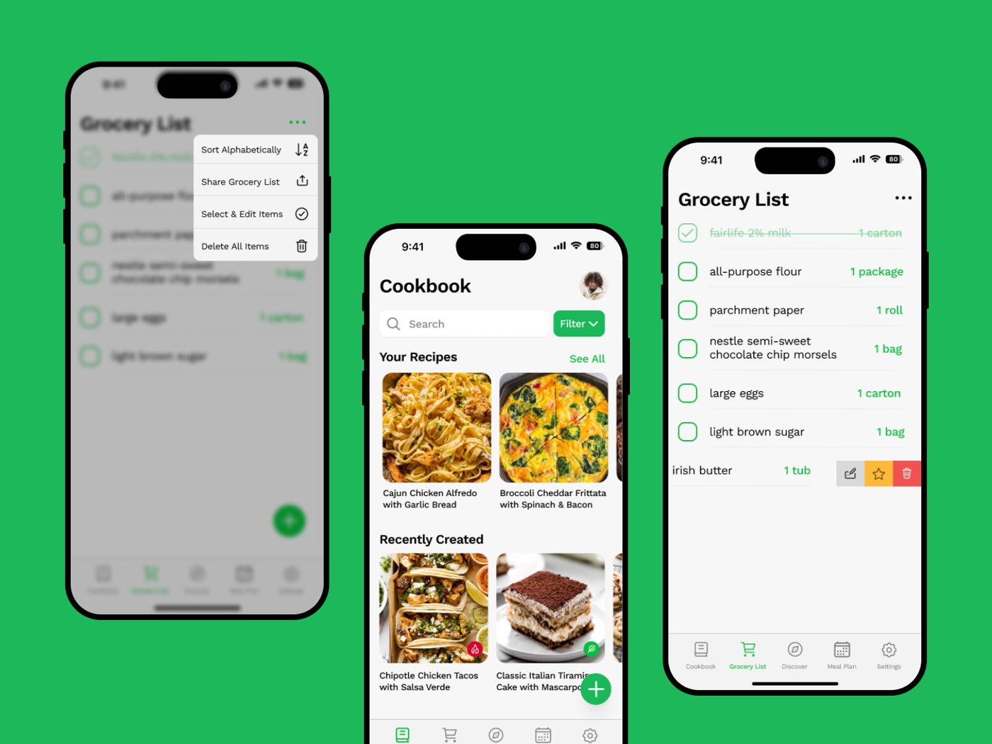
Cookbook food badgesProduct
resumes.fyi filter sidebarProduct
CougarCS ACM bannerGraphics
Lytra logoBranding
resumes.fyi resume cardsProduct
Splitt wordmarkBranding
CodeRED Genesis missions slideGraphics
resumes.fyi resume uploadProduct
Cerena icon construction gridBranding
resumes.fyi company taggingProduct
Resumes.fyi insightsProduct
resumes.fyi company directoryProduct
Monkey Lick Studios logoBranding
resumes.fyi company insights pageProduct
CougarCS good luck postGraphics
resumes.fyi recruiting graphicGraphics
Cookbook app screensProduct
Alumni Association lockupBranding
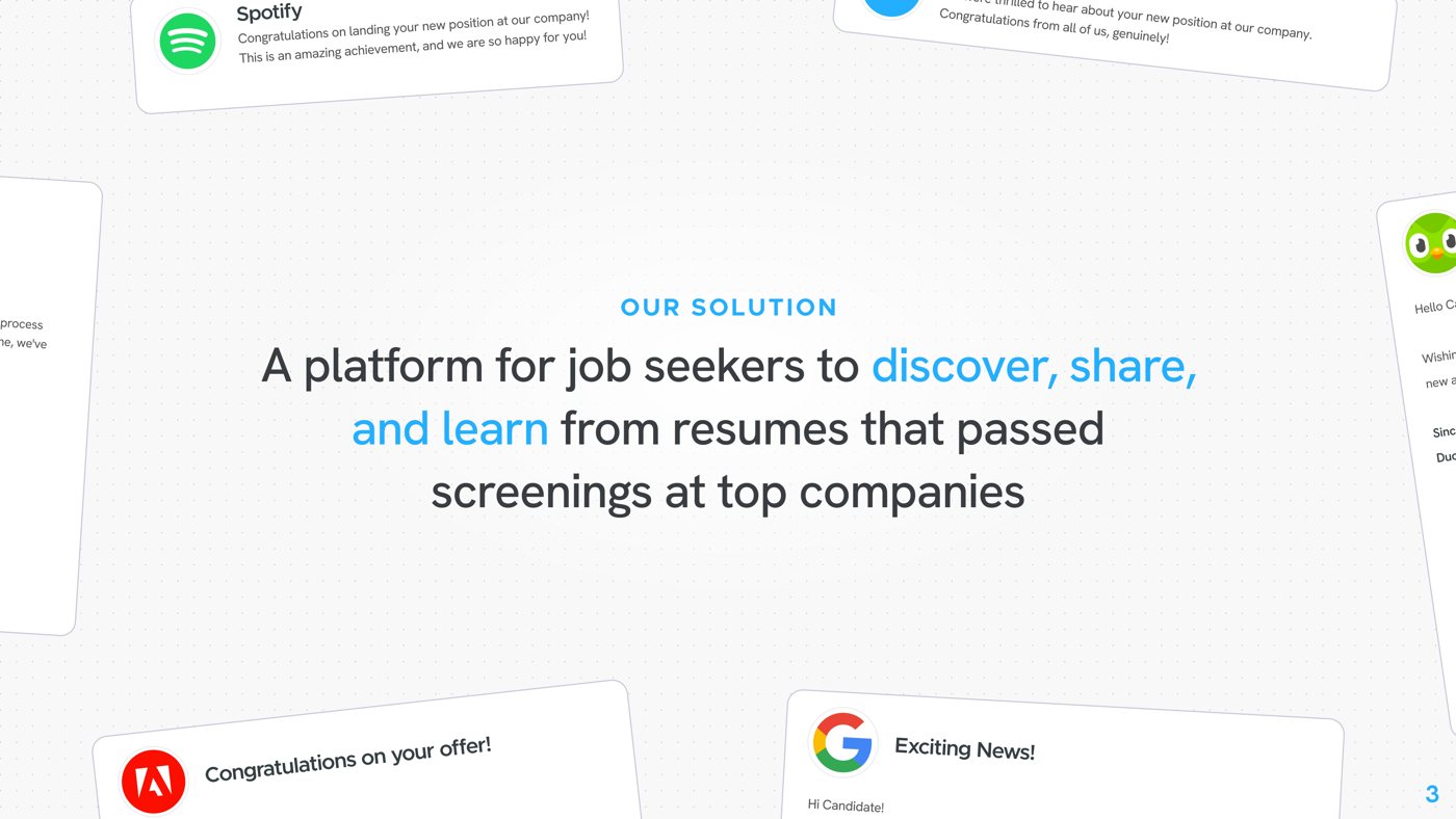
Resumes.fyi pitch slideGraphics
Countdown graphicGraphics
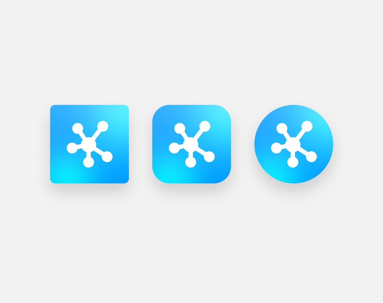
Cerena icon shapesBranding
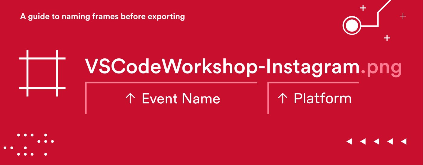
Frame naming guideGraphics
Cerena on iPhoneBranding
Nothing matches that search yet.
About me
Hey, my name is Jorell and this is my story, alongside a few photos from this year!
Sharing shaved snow with fresh mango with friends
Somewhere between design and code.
I studied computer science at the University of Houston, but a lot of my favorite work happened alongside it: leading the CougarCS rebrand, designing through two internships at PwC, and co-founding Resumes.fyi with five friends in my last semester.
The Empire State Building through the Washington Square Arch
Making it all happen.
Today I'm a product manager at American Express. The problems are bigger, but the goal is the same one I had in that digital media class: take something complicated and make it clear. Thanks for stopping by!
Amongst the sunflowers at Queen Wilhelmina Garden in San Francisco
Where it started.
I was born and raised in Texas. My first real taste of design came in a high school digital media class, where I opened Photoshop for the first time and didn't want to close it. That curiosity about how things look, and why they work, has followed me ever since.
Sunlight peeking through the trees at Sequoia National Park
In my spare time.
I love hiking and photography, so I'm usually out on a trail with a camera. Otherwise you'll find me cooking, playing Pokémon and Undertale, taking road trips, making Target runs, staying up too late talking with friends, and listening to ambient and hyperpop music.
Other moments to share
Down under the Manhattan Bridge
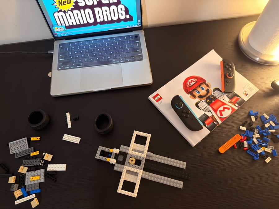
Building the Mario Kart LEGO set
Double rainbow sunset before a storm
Experience
American Express
Product Manager
I own strategy and design for Amex's central risk data platform, supporting enterprise risk reporting and management with strong data governance and regulatory controls.
Resumes.fyi
Co-founder
I co-founded Resumes.fyi and led design and product strategy from the ground up, including branding and user research, until it was acquired by Aced.
PwC
Product Design Intern
I designed an AI assistant for a tax platform used by tens of thousands of professionals.
Product Development Intern
I redesigned a nonprofit platform that connects students with career mentors.
CougarCS
VP of Marketing
I led a full rebrand of UH's largest CS organization, from logos and color to the website, social, motion and merch.