Resumes.fyi · Product Designer & Co-Founder · Aug 2024 – Feb 2025
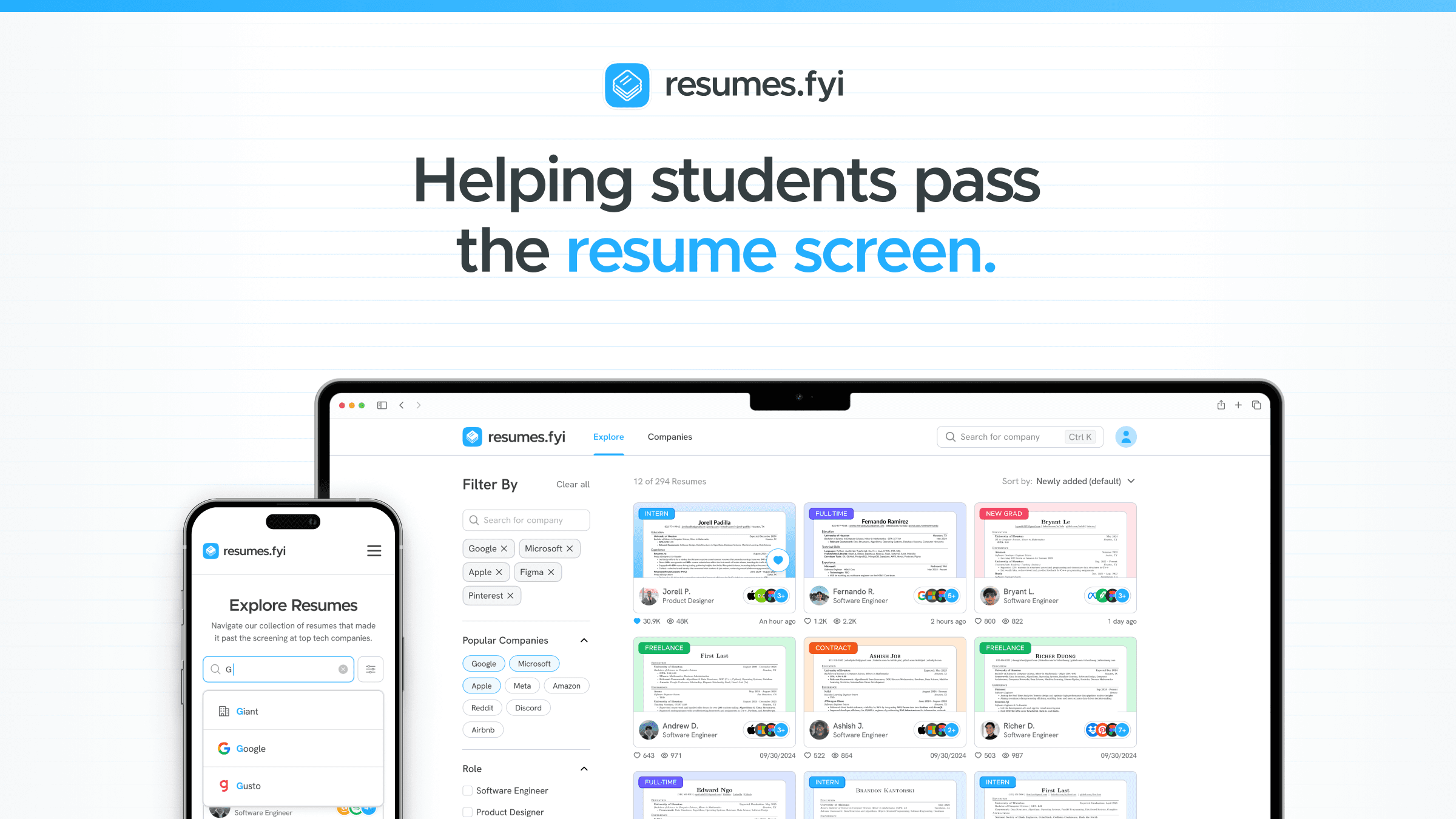
Helping students pass the resume screen and advance in the hiring process
I co-founded and designed a crowdsourced platform from scratch — showcasing real resumes that passed screenings at 140+ tech companies. Six months after launch, it was acquired by Exponent.
Overview
I was the user I was designing for
In the summer of 2024, I was actively applying for jobs — updating my resume, second-guessing my formatting, and wondering what actually gets someone past the initial screen. I kept searching for real examples of resumes that had worked at companies I cared about. There was nothing useful out there.
When I brought this up to a group of friends, five engineers had the same frustration. That conversation turned into Resumes.fyi — a platform where people who passed screenings at top tech companies could share their resumes, and job seekers could learn from them. I was the sole designer for the entire product, and six months after we launched, it was acquired by Exponent in February 2026.
Understanding the Problem
Before designing anything, I needed to know if the problem was real
My own frustration felt like enough validation — but personal experience is a data point of one. So before we touched Figma, I ran a survey of 584 people and followed it up with 25 in-depth interviews, talking to university students, recent grads, and professionals who’d been through the hiring process multiple times.
The answers were consistent across all three groups: people weren’t confused about what to put on their resume. They were confused about whether it was good enough — whether the language was right, whether they were even in the right ballpark for the companies they wanted. Without a real benchmark, everything felt like a guess.
“I just want to see a resume that actually got someone into Google. I don’t care if it’s perfect — I just want to know what ‘good enough’ looks like.”
— Interview participant, junior CS student
Research synthesis — mapping where people feel most uncertain in the job search

Persona 1 — Sarah, applying for her first tech role with no frame of reference

Persona 2 — Claudia, switching careers and unsure how to reframe her background
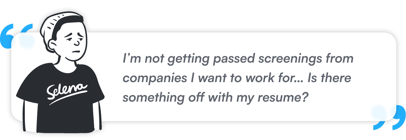
Persona 3 — Tommy, applying for months and not getting past the screen
Branding & Identity
We needed to look like something people would trust enough to upload their resume to
The platform only works if people contribute — which means the identity had to feel trustworthy, but approachable enough that students didn’t feel like they were submitting to a corporate directory. I landed on a brand that borrowed visual language from the world of studying — sticky notes, paper textures, grids, pins. Something that felt made by students, for students.

Brand identity system — logo, type, and color palette
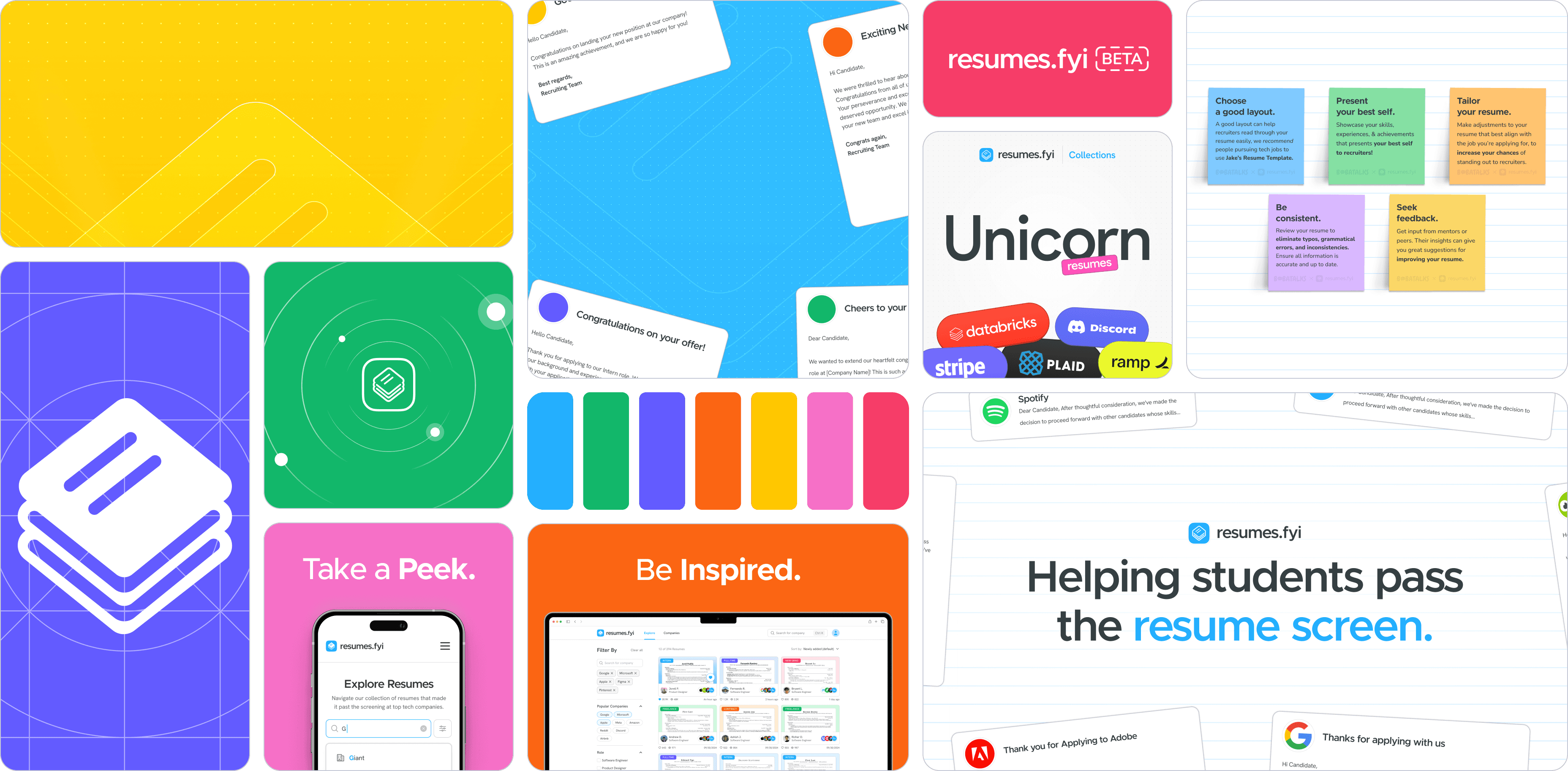
Marketing materials, social assets, and collateral

Feature ideation — narrowing down the MVP scope
Design Process
Every screen had a job to do — and I cut the ones that didn’t
The upload flow was asking too much
The platform’s value comes entirely from what users contribute. If uploading feels like filling out a job application — which our first version did — people will just leave. I streamlined it so users could skip unnecessary inputs and interact with resumes like a PDF.
Before — Multi-step, high-friction, no skipping, no preview
After — Optional fields, skippable steps, live resume preview
“After redesigning the flow to let users skip unnecessary steps, resume submissions went up 52%.”
The explore page needed to surface signal instantly
I ran an A/B test between the original layout and a revised version with a persistent sidebar, enhanced card metadata, and color-coded resume cards. Users spent more time browsing and engaged with more resumes in the revised version.
Before
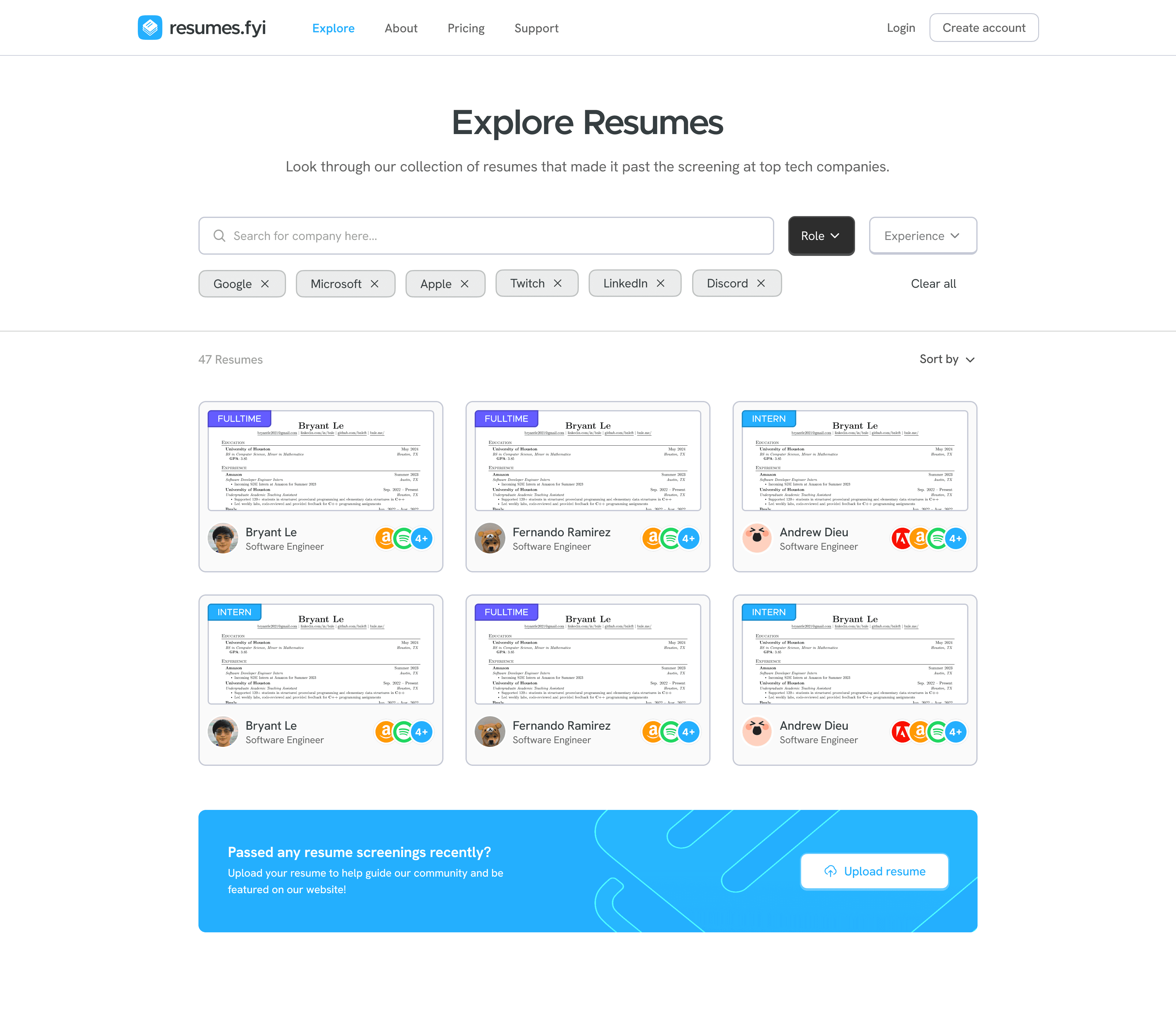
V1 — filters at top, heavy scrolling
After
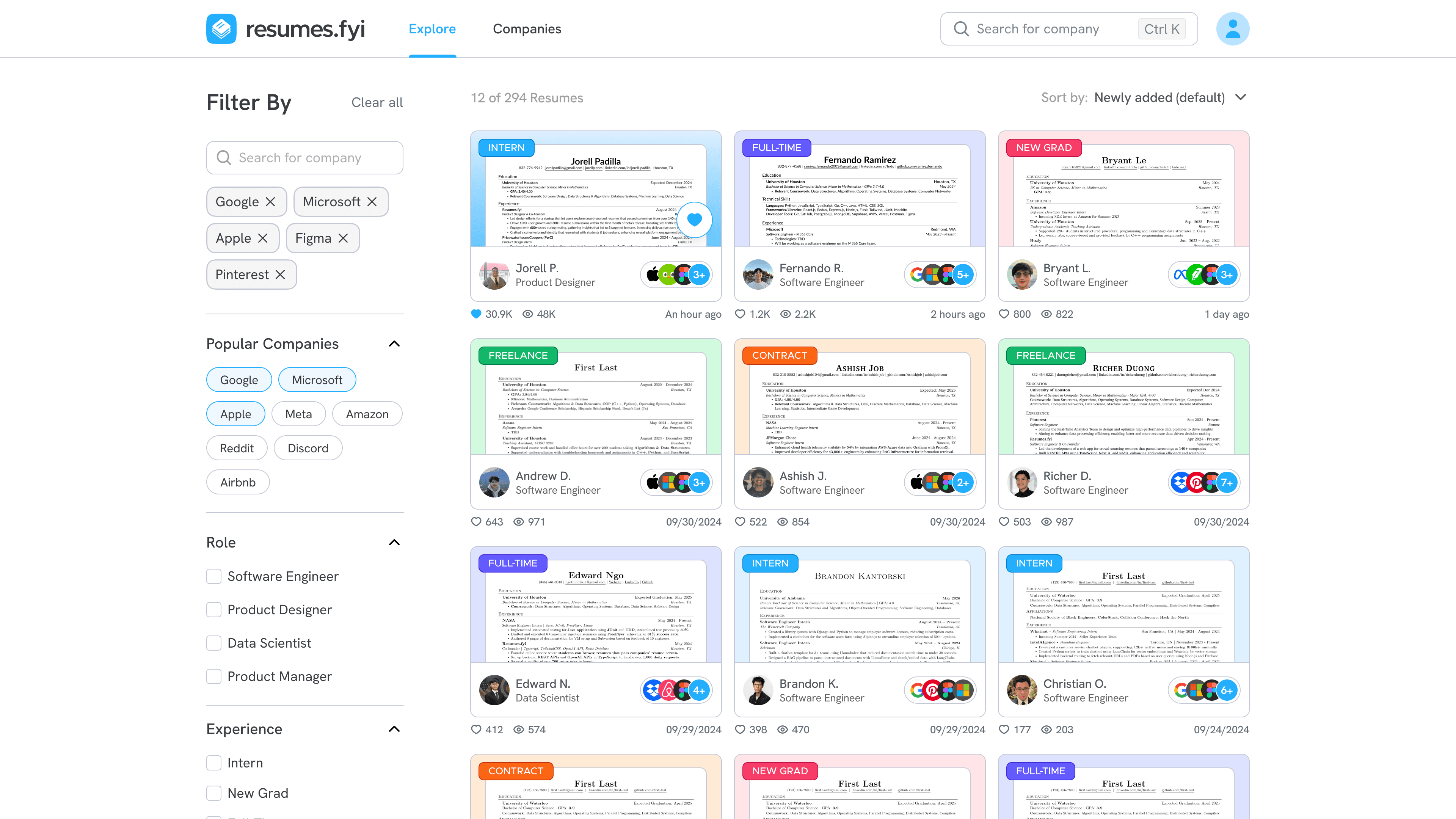
V2 — persistent sidebar, richer cards
Outcome
Acquired by Exponent — February 2026
Six months after launch, Resumes.fyi was acquired by Exponent. This project taught me what it means to design something end-to-end — brand, product, decisions about what to build first, and constant negotiation between what users want and what the team can ship. I was doing all of that while being one of the users myself.
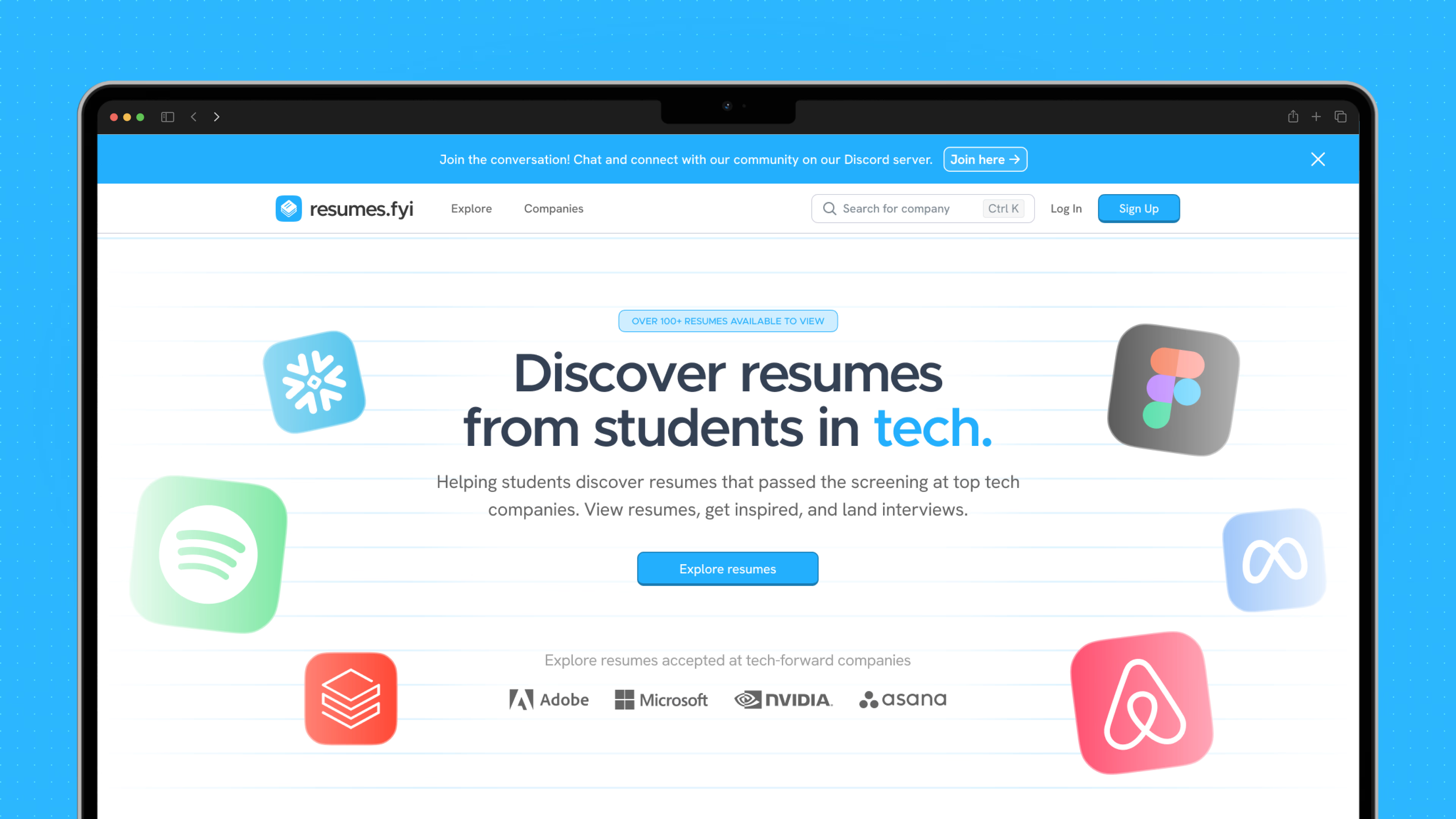
Home page — crowdsourced resumes from 140+ tech companies
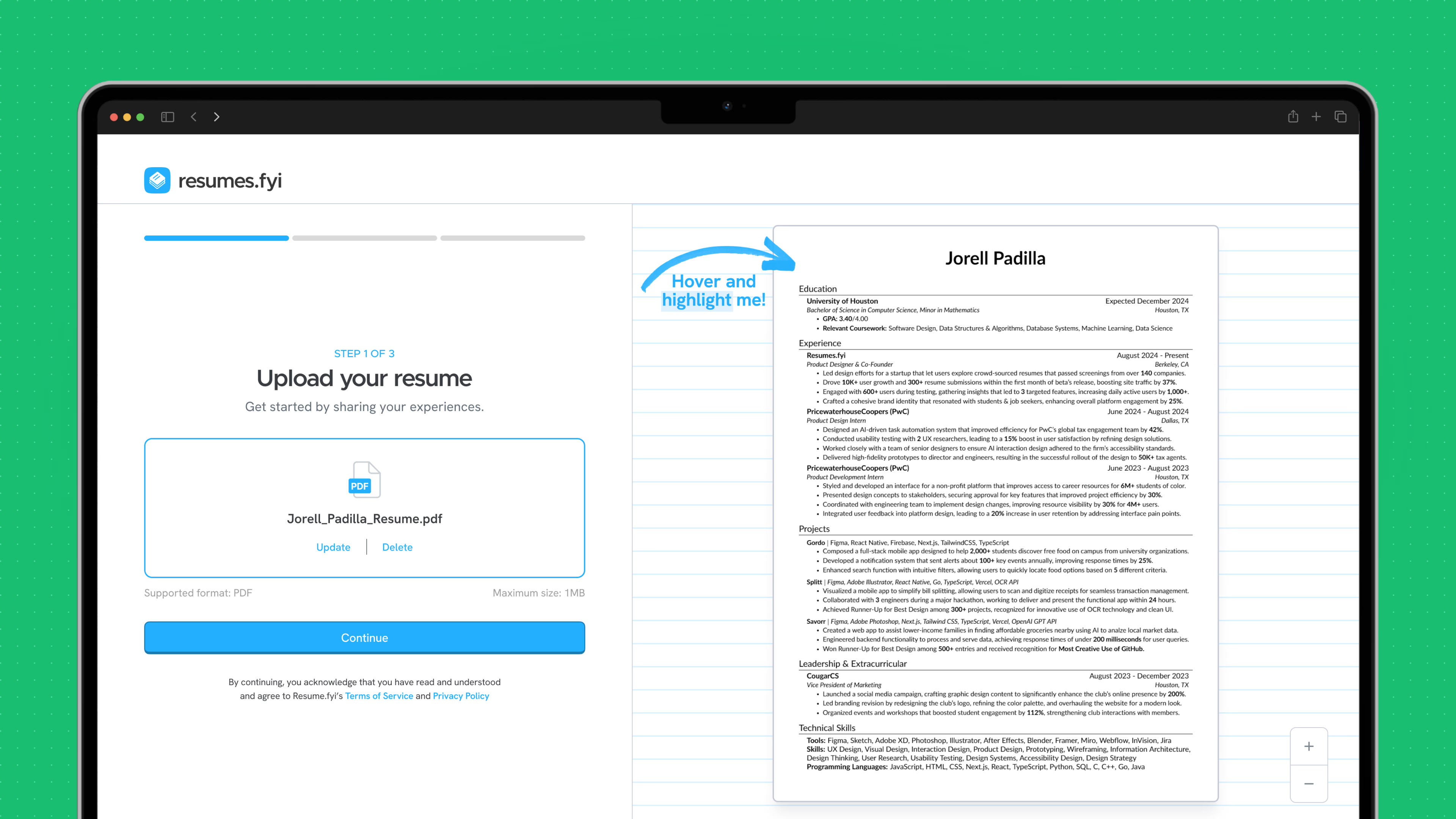
Upload flow — step one of the resume submission process
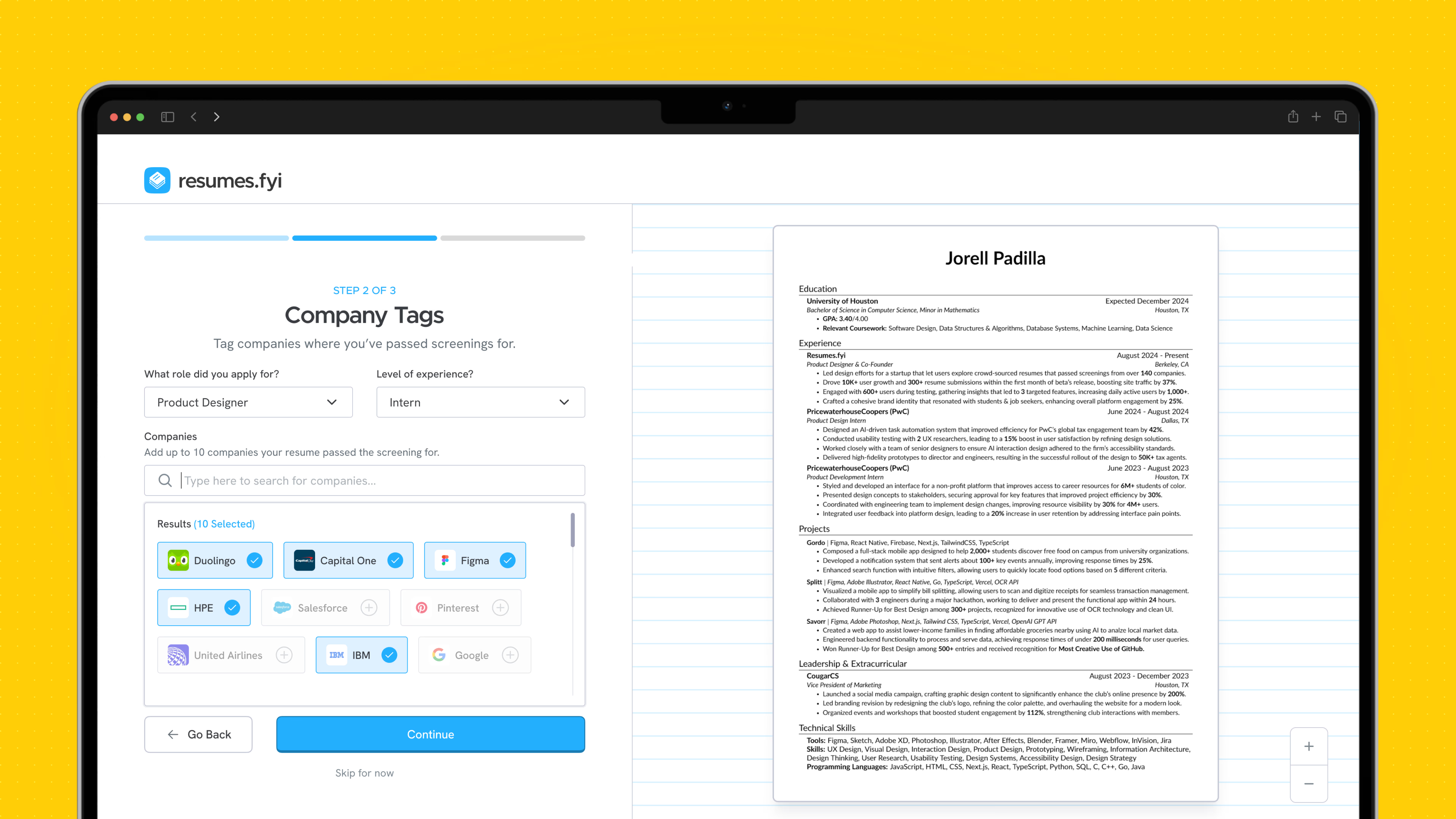
Company tagging — linking your resume to the companies where it passed screening
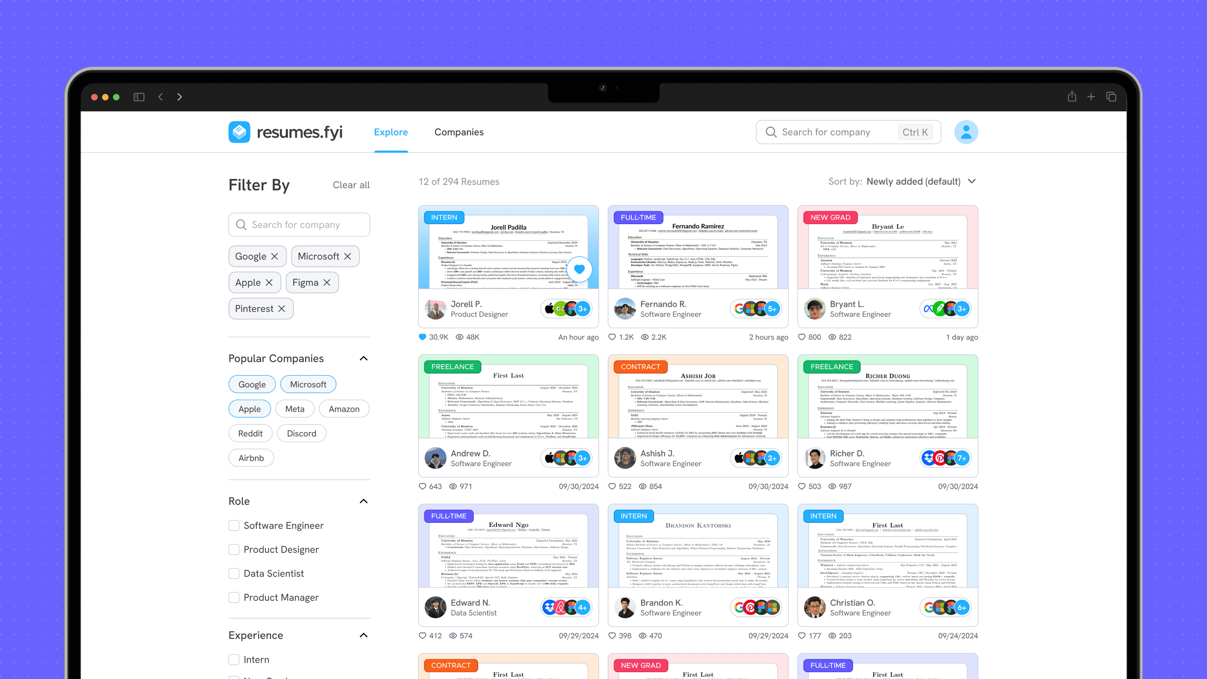
Resume collection — color-coded by experience level
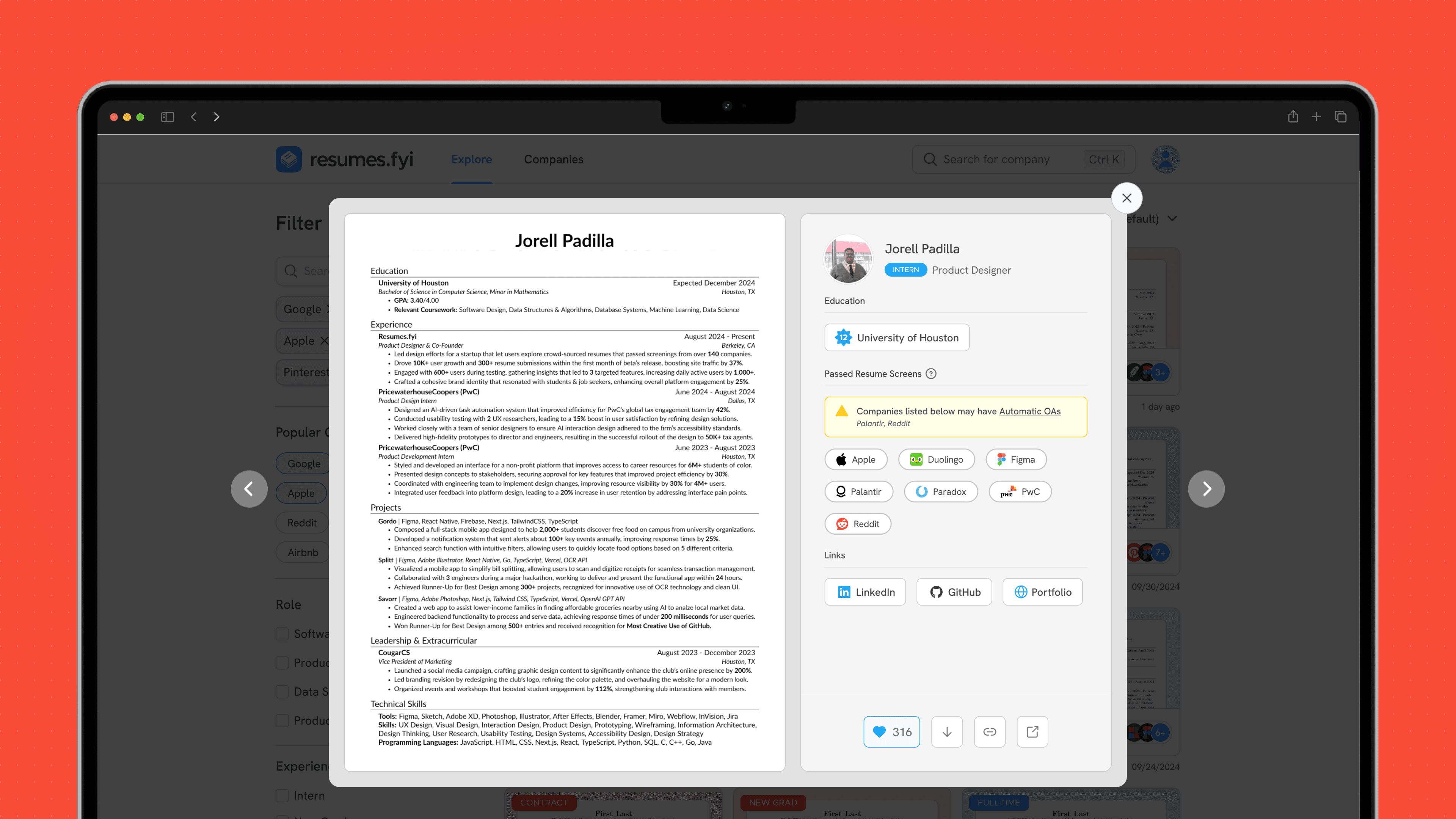
Resume detail modal
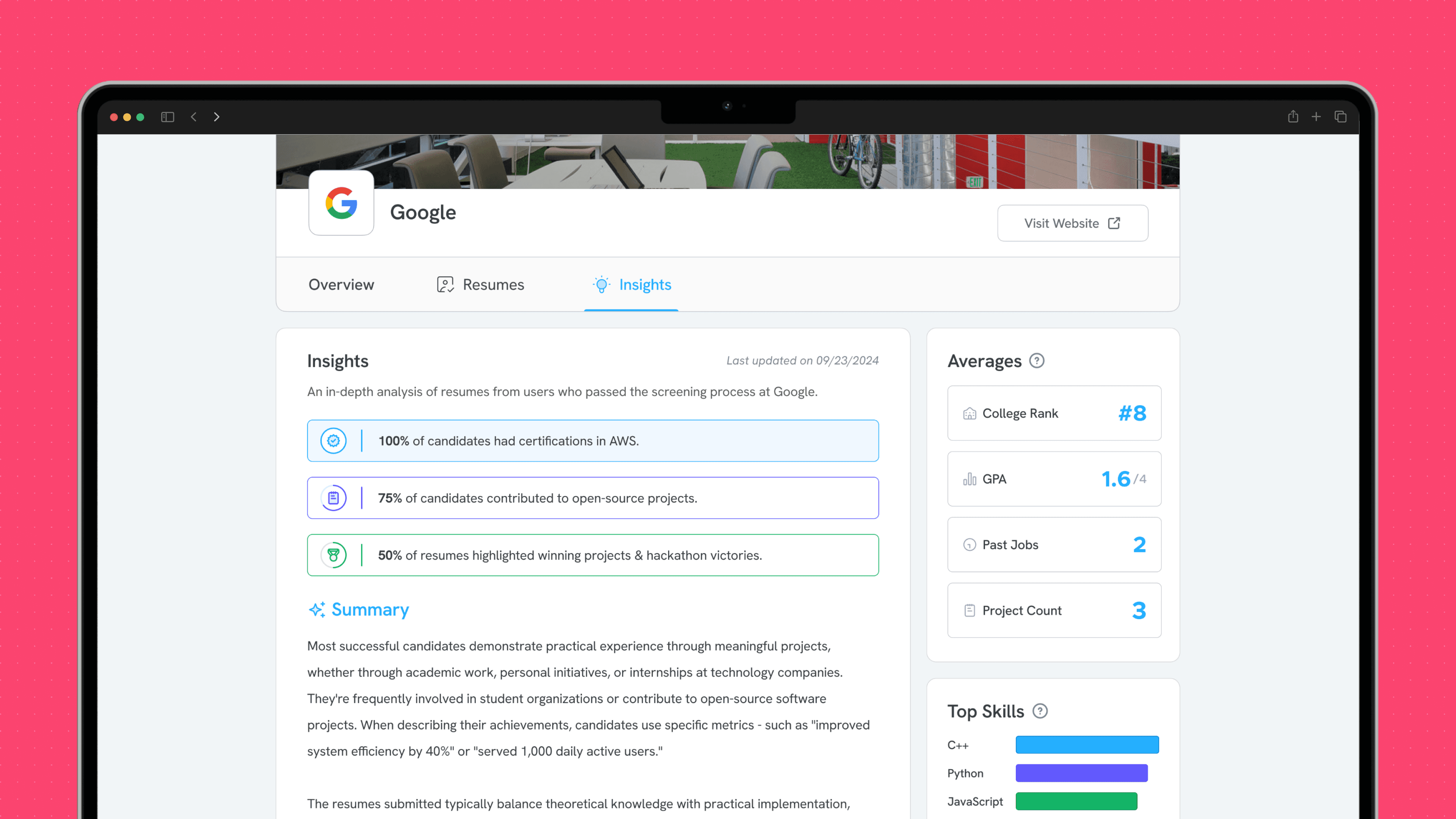
Company insights — overviews for 140+ companies
Six months of building, iterating, and listening to users taught me more about product design than anything else I’ve done. I’m proud of what the team shipped, and even prouder that it found a home at Exponent where it continues to help students land their next opportunity.
